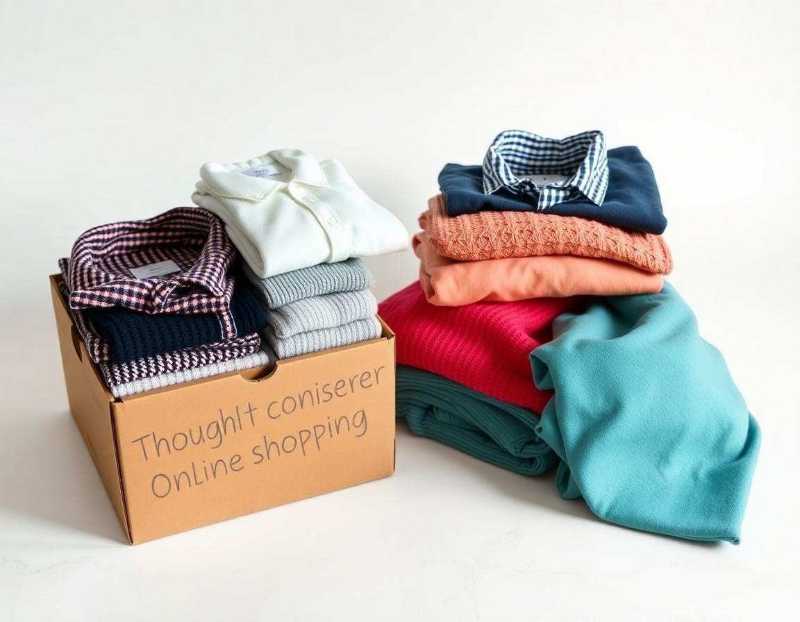
You know the scene. One tab for the brand you always buy, another for the one a friend recommended, a third for the sale you saw on Instagram, plus two more for the comparison searches you opened and forgot about. By the time you've found the jacket you want, your browser looks like a ransom note and you've lost track of which price was the good one. Cross-brand shopping shouldn't feel like air-traffic control.
Why one purchase turns into a dozen tabs
Modern shopping is rarely loyal to a single label. The perfect outfit might pull a coat from one brand, jeans from another, and boots from a third — and each of those lives on its own website, with its own layout, its own login, and its own idea of how to show a product. So you open a tab per brand to keep your options alive, then more tabs to compare, then a few you're afraid to close in case you can't find them again. The friction isn't in any single store; it's in the gaps between them.
The hidden cost of tab-juggling
All that switching has a real price beyond a cluttered screen. Every tab is a separate context your brain has to reload — different sizing conventions, different return policies, different ways of naming the same shade of beige. Decision fatigue creeps in, and the tireder you get, the more likely you are to either buy on impulse or give up entirely. Worse, comparing across tabs is genuinely hard: you can't see two products side by side, so you end up flicking back and forth, holding details in your head and hoping you remember them correctly.
There's a time cost too. Loading, logging in, dismissing cookie banners, and re-entering your size on every site adds up fast, and most of it is busywork that has nothing to do with the actual decision. The minutes you spend wrangling tabs are minutes you're not spending on the only thing that matters: choosing what you'll genuinely wear.
What “one place to shop” actually means
A single place to browse multiple brands doesn't mean one mega-store that buries everything. It means a consistent surface where catalogs from different labels are presented in the same format, so the only thing that changes from item to item is the clothing itself — not the interface around it. When the layout stays put, your attention goes where it should: on the cut, the color, and the price, rather than on relearning how to navigate.
Think of it like a well-organized department store versus a row of separate shops down a busy street. In the department store you walk one floor, compare two coats hanging beside each other, and check out once. On the street, every shop has its own door, its own queue, and its own bag.
Browsing and comparing without losing your mind
The whole point of consolidating brands is to make comparison effortless instead of exhausting. A few habits help, whether you do this in a browser or an app:
- Decide your criteria first. Pick the two or three things that actually matter for this purchase — say, color, length, and budget — before you open anything.
- Shortlist, don't hoard.Save three to five candidates max. More than that and you're back to tab chaos, just in a different shape.
- Compare like for like. Line up the same garment type across brands at the same time, rather than judging each in isolation.
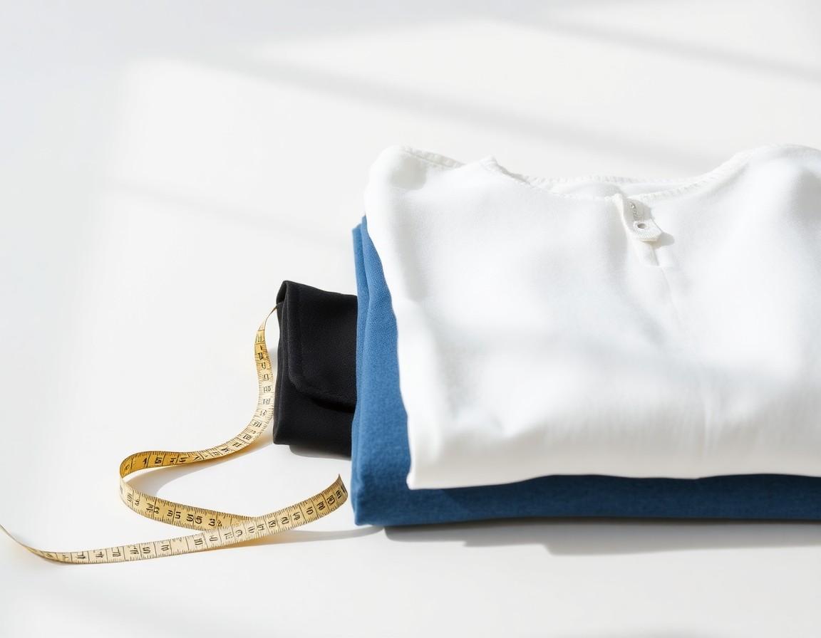
- Note the deal-breakers. Return window, shipping cost, and fabric are the details that quietly decide whether you keep something — check them up front, not after it arrives.
The part comparison still misses
Even with everything in one tidy view, there's a question no catalog answers: how will this look on you? Two brands can show the same trench coat on two different models, in two different lights, and you still can't tell which one suits your frame and skin tone. This is exactly where cross-brand shopping tends to stall — not at finding options, but at picturing yourself in them. You can gather a dozen great candidates and still end up paralyzed, because a grid of products on strangers tells you almost nothing about how any of them lands on your shoulders or against your complexion.
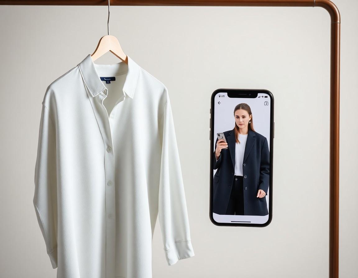
Previewing different brands on the same photo
Here's the move that genuinely shortcuts the tab problem: instead of judging each brand on its own model, preview them all on the same photo of you. When the body in the picture is constant, the only variable left is the clothing — so comparing a blazer from one label against a blazer from another finally becomes an apples-to-apples decision. It turns “I think this might work” into “I can see how this works.”
Worth being honest about: a virtual preview is a visualization, not a measurement. It's great for color, silhouette, and overall vibe across brands, but it won't tell you whether a particular brand's medium runs small — for that, you still check each brand's size guide. Used that way, previewing across brands is a powerful filter for narrowing the field before you commit.
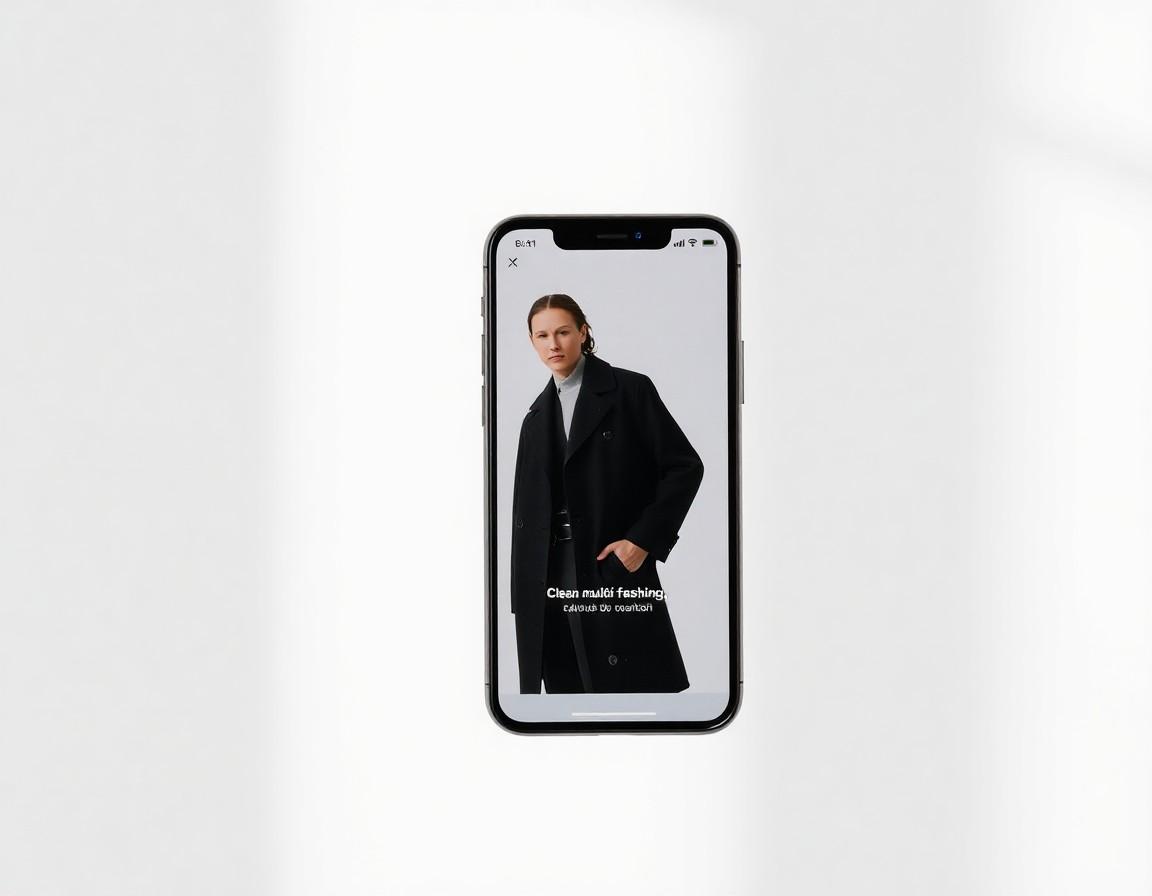
Bringing the brands together with TRYSHOP
This is the gap TRYSHOP is built to close. It puts catalogs from top brands in one consistent place on your phone, so you can browse and compare without a screen full of tabs — and then preview any item on your own photo to see how different brands actually look on you. Shortlist the pieces you love, line them up against each other, and decide with a lot more confidence than a row of mismatched websites ever gave you.